Creating a Real Estate Development Sign in Illustrator
Follow us step by step as we create an 8ft x 4ft Real Estate Development Sign. Throughout the tutorial you will learn to get comfortable utilizing a variety of techniques and tools in illustrator that you may not already know.
This tutorial assumes that you have some basic knowledge of Illustrator such as how to fill objects, navigate around some of the menus, ungroup, etc We will give as much instruction as possible, but if you are completely new to Illustrator you may want to go over some of the basic functions first to make this tutorial easier to complete. We won’t cover the 3D angled rendering, just the 2D flat portion.
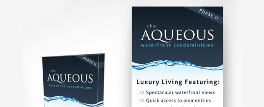
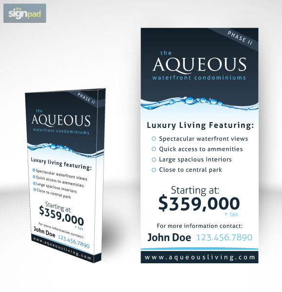
Here is what we are going to create:
Getting started:
There are a number of resources that you are going to need before starting the tutorial. If you want to maintain the same look as we have you will require 2 freely available fonts that we have provided download links for.
You are also going to need to download our base illustrator file for the tutorial which contains the graphics you need to get started and follow along.
You will need to download and install the free fonts as well, the 2 fonts you will need are:
Download and install these before opening the base Illustrator file. If you do not want to install the fonts that is fine, in the base illustrator file we have given you the “Aqueos” logo that does not require you to install the fonts. You will have to use your own fonts for the rest of the text on the sign however.
Everything ready to go? Let’s get started!
Step 1
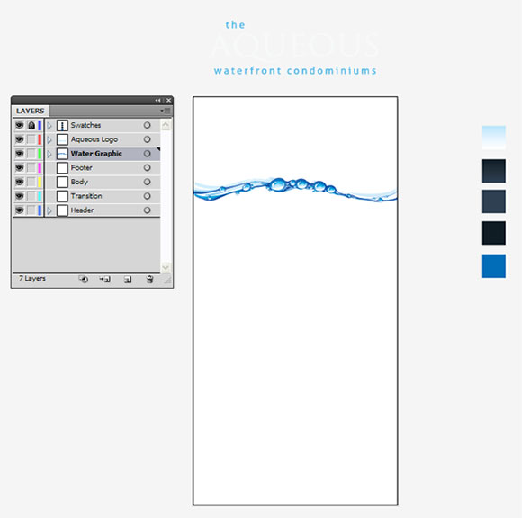
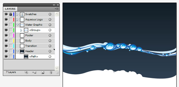
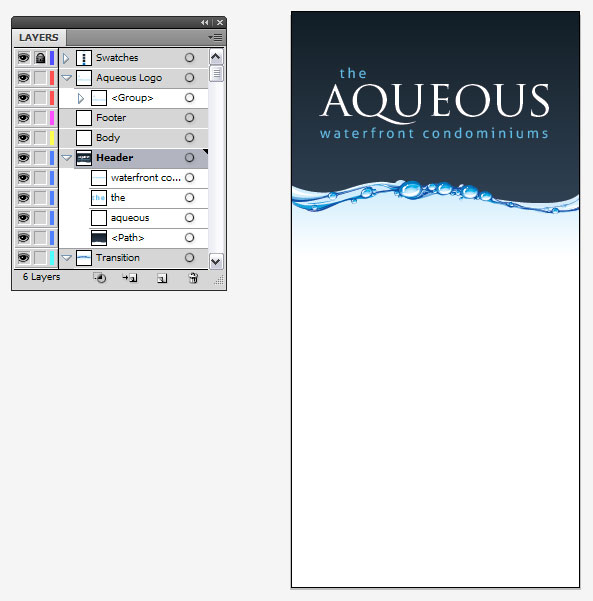
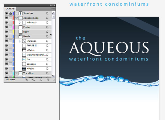
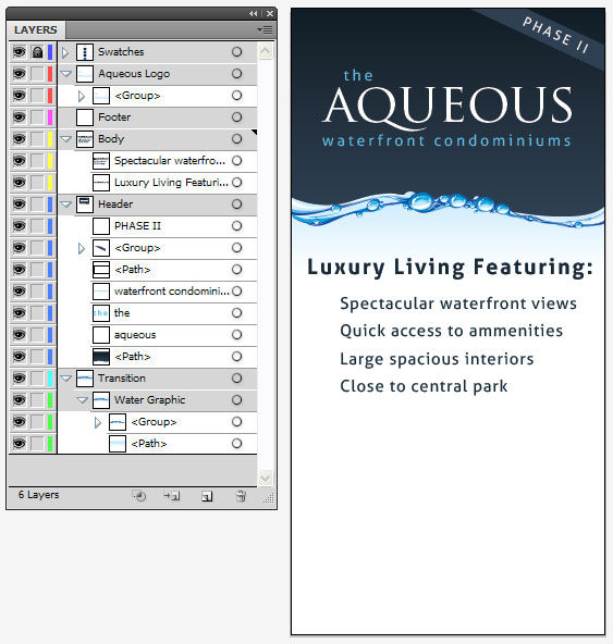
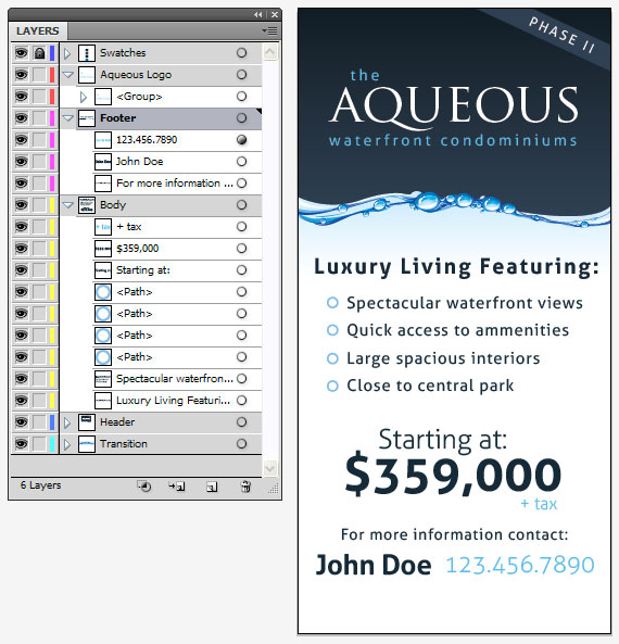
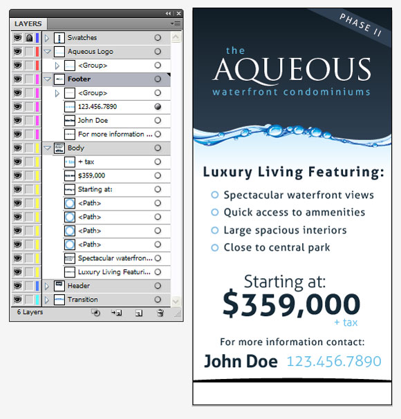
Lets make sure that you’ve got the “base” file open and ready to go. Download the file above if you haven’t’ already, open it up in Illustrator (you will need version CS or above) and check that everything is as shown. As you can see we’ve included the vector water graphic for you, the Aqueous logo (if you didn’t’ want to install the fonts) as well as the color swatches that we will be using in the design. The layers are already organized for you. We will reference these layers throughout the tutorial.
The artboard is setup at 24” x 48” tall (50% scale). So you would upscale this to 200% before final printing to create the 8ft x 4ft size.
Let’s get started, make sure you have your layers palette ready, and that everything is there in the base file for you as shown.
Step 2
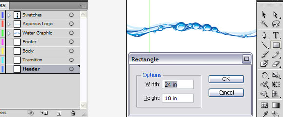
Lets start by creating part of the top background that our logo will sit on. We will use the rectangle tool (M) on your keyboard. Start by selecting the “Header” layer to make sure it is active, then click anywhere in the design using the rectangle tool (M) and a sizing box for your rectangle should come up, let’s make it 24” wide by 18” tall.
Step 3
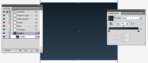
Lets add a gradient color to our rectangle. You can use the eyedropper tool (I) on your keyboard and then select the dark gradient from the swatches layer we’ve provided in the base file (it’s the 2nd swatch down on the right). This should change the fill to our dark blue gradient. Using the gradient flyout options, make sure that the angle is set to 90, as shown.
Step 4
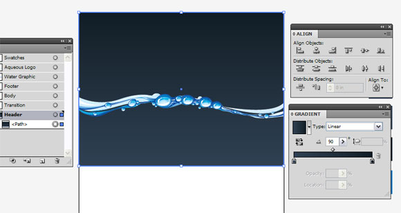
Now align our rectangle to the top of our artboard using the “align” option ( Window > Align) . Make sure the Align To: Artboard is selected first. Then select the “Horizontal Align Center” icon, and then “Vertical Align Center” icon. It should now be at the top of your artboard as shown.
Step 5
Over the next few steps, you are going to learn to use the pathfinder and create compound shapes. We need to create a contoured cutoff (not square) at the bottom of our rectangle, so we will need to use the pathfinder tools to do this.
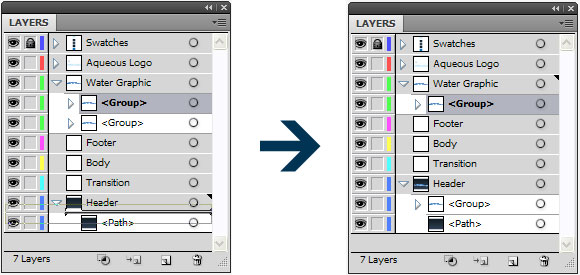
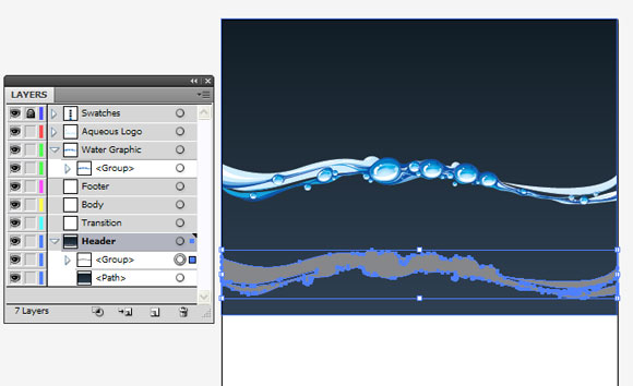
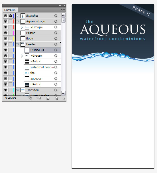
Start by select the “water graphic” layer. Copy the layer (Ctrl – C), Then select “Edit > Paste in Front”. This will paste a copy ontop of the bottom one. Now in your layers palette, drag one of the copies of the water graphic down into our “Header” layer as shown.
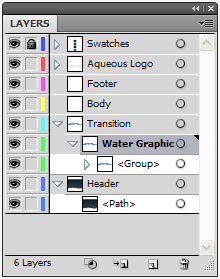
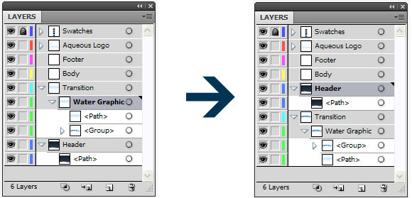
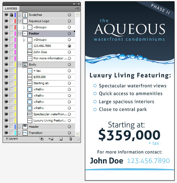
Your layers palette should now look like the one above to the right.
Step 6
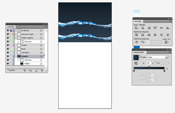
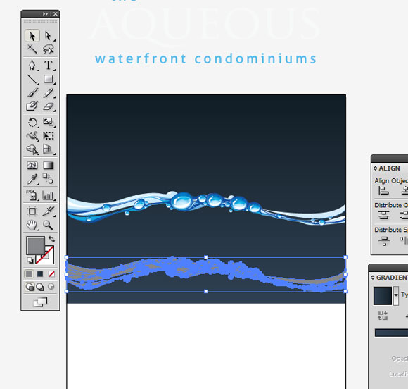
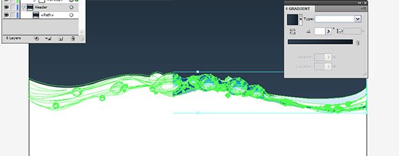
Now, making sure you have the water graphic in the “Header” layer selected, hold down SHIFT, and move the graphic down near the bottom of our rectangle as shown.
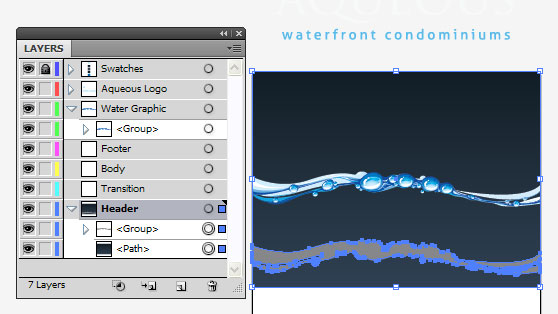
Now, right click on your watergraphic on the bottom and select “ungroup”. Next fill it with any color (it doesn’t matter what, we are only use these temporarily). Here is what you should look like now.
Next under the “pathfinder” (Windows > Pathfinder) select the “Unite” option under shape modes. This will create a solid shape out of all the ungrouped layers. You should now have something that looks like this.
Step 7
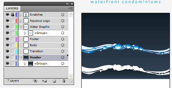
Now we are going to use this new shape to “cutout” on our background gradient layer. Making sure that you’ve got the current layer selected (highlighted), hold shift, and click on your dark blue path in your header layer. You should now have BOTH selected as shown. You can confirm this by looking in your layers palette to see both layers selected as well.
Now under your pathfinder menu again, select “Minus Front” under shape modes. You should now end up with something like this.
Step 8
Now right click on your shape under “header“ layer and select “Ungroup” and deselect by clicking anywhere outside the artboard. Now you will need to delete any of the shapes below the large one as shown. You can click each one individually and select “delete” on your keyboard, or you can use your layers palette, and holding “shift” select all the shapes in your header layer that are not above your large shape and drag them to the trash can. After completing the step here is what you should be left with.
Step 9
In your layers palette drag the “water graphic” layer onto the “transition” layer so that it is nested inside it.
Next move the “water graphic” down until it is slightly overlapping the bottom of your dark blue gradient. Take a look at mine to see where I positioned it. I’ve shown it both in outline mode, and in preview mode to give you a better idea.
Here is what you should have after completing this step.
Step 10
If we haven’t’ lost you yet congrats! You are over the hard parts! Next we want to create our light blue gradient effect. So that we have that nice transition.
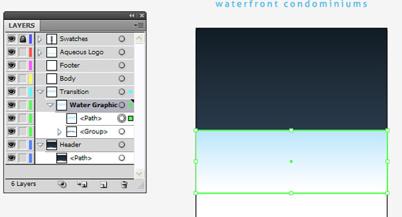
Making sure you are still on the “transition” layer, create another rectangle using the rectangle tool (M) on your keyboard. Make the size of this 24” x 8”. Make sure it is aligned horizontally center on your artboard by select “Horizonatal Align Center” button in your Align menu.
Next using the eyedropper tool, give your rectangle the light blue gradient by clicking on the sample gradient we have provided off to the right of your artboard (the locked swatches layer). It will apply that gradient to your new rectangle for you. Make sure that the gradient is set at “-90” for angle under the gradient options menu. You should have something that looks like this right now.
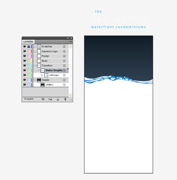
Next we are going to re-arrange our layers so that we start to get the desired effect. Move your gradient rectangle underneath the water graphic group. Then move the “header” layer above the “transition” layer. Here is a before / after of your layers pallete for this step. Move them around till yours looks like this.
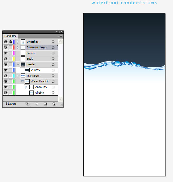
After doing this, you should see the design starting to take effect. Here is where you should be after this step.
Step 11
NOTE: If you didn’t install the fonts we used at the start of the tutorial, you can use the already predone logo in the “Aqueous Logo” layer and move it into position. For this tutorial we are going to great the text / logo from scratch as well.
Now it’s starting to take shape, so let’s start by adding our logo in. Click on the “header” layer, and then grab your text tool. Type the world “aqueous” (yes lowercase) using the font Trajan. I use 294 pt for this. Make the color of the text white.
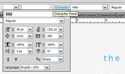
Now, also using the text tool, create the word “the” in Aller Regular font, size 85pt.
Lastly, create the word “waterfront condominiums” in Aller Regular font as well, all lower case, and in 85 pt.
Select both of the words “waterfront condominiums” and “the” and then change them to this hex color value: #59BBEA.
Change the horizontal “character tracking” of the words “the” and “waterfront condominiums” to 200. Here is where the horizontal character tracking settings can be found.
Re-arrange the words until they are close to the logo as shown, and then move them over top of your dark blue gradient background. Here is what you should have after this step.
Step 12
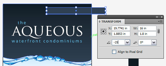
Lets add our “Phase II” text and background strip in. Still in the “header” layer, create another rectangle using the rectangle tool (M). Make the size of this 16” x 1.8”. Yes, it’s larger than we need it, but you’re are going to learn to use a “clipping mask” to only show the size we want.
Change the color of the rectangle to hex color value #2F4053, and in the “transform menu” rotate it “-25” degrees as shown.
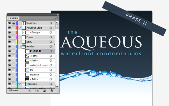
Now create the “Phase II” text. We used Aller Regular in all capitals, and sized 74pt. Use white. Now rotate in the transform menu -25 so that they are the same. Position both of them up in the corner as shown.
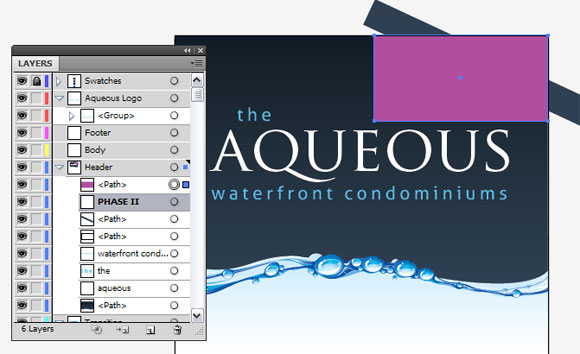
How using your rectangle tool, click and drag to make a box overtop of where you would “crop” the brand. Your box should look like this.
Now you should still have your rectangle selected. Add to this selection by holding SHIFT and clicking on your long band below it. With both of these selected now, right click on them and select “Make Clipping Mask”. It will now mask just the area you told it too as shown.
Move your “Phase II” text up on in your layers palette so that the text is ABOVE your clipping mask. Here is what you should have after this step.
Step 13
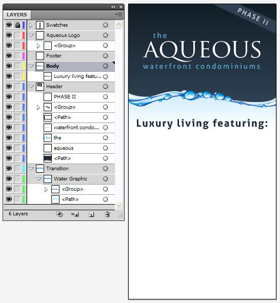
Now that the “header” and “transition” are done, we can work on creating all the text in the body of the sign. Making sure you’ve selected the “body” layer, grab the text tool (T) and create the word “Luxury living featuring:”. Font should be “Aller Bold” in 118pt with horizontal tracking set to 100. Set the color to hex color #152A38. Place it roughly as shown here.
Step 14
Now making sure you are still on your “body” layer, grab the text tool (T) and type in the following “Spectacular waterfront views” hit enter to create a new line and type “Access to amenities” then on another new line type “Large spacious interiors” and then lastly on another new line type “Close to central park”.
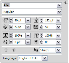
Use the font “Aller Regular” at size 90pt, and in the same hex color we used before “#152A38”. You will need to set the text’s “leading” to 120pt, and the horizontal tracking to 50 as shown in our text flyout.
Now put the text roughly into place as shown below, make sure it is off to the right slightly as we are going to be putting our bullet points in there as well.
Step 15
Lets add our bullet points in. Using the Ellipse Tool (L) on your keyboard (if you don’t know where to find it, press and hold on the “rectangle tool” and more options will fly out (one of them being the Ellipse Tool).
Making sure you are still on your “body” layer, click the elipse tool anywhere for it to bring up the sizing options. Make your cirlcle “0.75 in” by “0.75 in”. Alternatively, you can hold SHIFT on your keyboard and drag on your screen until the circle becomes the size you should like.
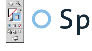
Now let’s set the stroke color of our circle, enter this hex color “#85BEE8” into the stroke color properties as shown.
Illustrator has 2 property values there, instead of foreground and background colors like Photoshop, this contains your “fill color” and “stroke color” Once you have set the stroke color as above, change the stroke weight to 10pt as shown.
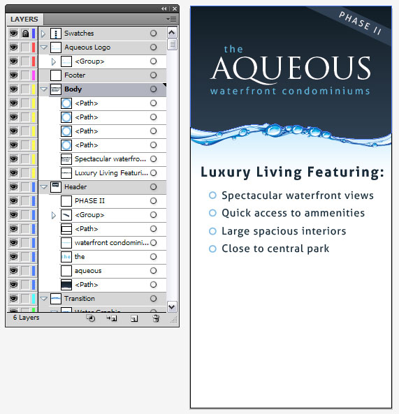
Now move your circle close to the top line of text that says “Spectacular waterfront views”. You are then going to create a copy of your circle. Hit CTRL+C or (Edit > Copy) and then select Edit > Paste in front. Now holding SHIFT, drag your circle down until it lines up with the next line. Holding SHIFT ensures that it drags in a straight line. Keep on repeating this (the copy, then paste in front) until you’ve put a bullet / circle beside each line of text as shown. Here is what you should end up with.
Step 16
Now let’s go ahead and create our pricing text. Using your text tool, create these 3 separate text entities
“Starting at:” in Aller Light at 150pt, and hex color value #152A38
“$359,000” in Aller Bold at 270pt, and hex color value #152A38
“+tax” in Aller Light at 95pt, and in hex color value #5BBBEA
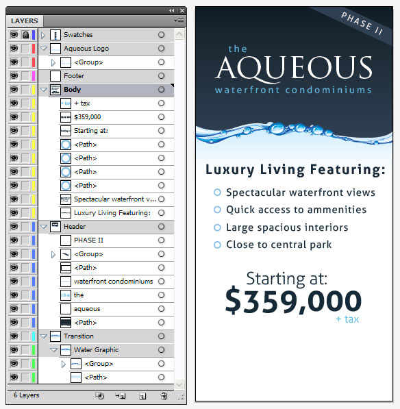
Now position these 3 text elements as shown, and you should end up with this.
Step 17
We’re almost there! We’re going to start creating our footer now to finish it off!
Click on the “footer” layer, and then grab your text tool again. Create the following text elements inside the footer layer.
“For more information contact:” in Aller Regular, 85pt, and Hex Color Value #152A38, set the Horizontal Character Tracking to 50.
“John Doe” in Aller Bold, 155pt, and Hex Color Value #152A38, set the Horizontal Character Tracking to -10.
“123.456.7890” in Aller Light, 130pt, and Hex Color Value #5DBBEA. Character tracking set to 0.
Place the above text elements so that you get this.
Step 18
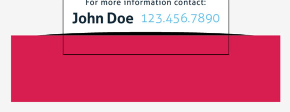
Now all that is left is the create the last few elements of our footer. Let’s first create the rounded line at the bottom. Get out your Ellipse tool (L) on your keyboard, and click anywhere on your artwork to bring up the Ellipse size box. Make it 37” x 2.2”
Now Alight Center your ellipse to the artboard as shown.
Now, create another a rectangle using the rectangle tool that is wider than your ellipse. Size it 39” x 9”. Align this centered as well and place it over top of your ellipse shape as shown.
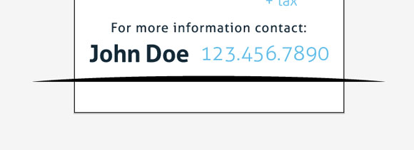
Now, hold SHIFT, and select your ellipse behind the box so that both the ellipse, and your rectangle are selected. In your pathfinder flyout, select “Minus Front” from the Shape Modes. You should now get the following.
Step 19
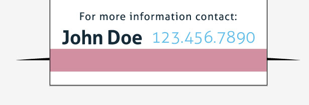
Now let’s create a clipping mask to stop it from going past our art board. Using a the rectangle tool, create a rectangle 24” x 2.5”. Align it to the center of your art board, and then holding shift, place it over top of your newly created arc shape as shown.
Select both shapes (hold shift before you select the 2nd shape) and then right click on either and select “Make Clipping Mask”. Your design should now look like so.
Step 20
We want to change the color of our newly created arc to a light blue, double click on the arc to enter “isolation mode”, you should then see the color of your current arc set in the fill properties in your tool palette. Change the value of this to hex color code #5FBBEA. To exit “isolation mode” simply double click anywhere outside of the artboard, and you will see it return to normal. After this step, it should look like so.
Step 21
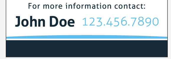
Lastly, we will create our bottom footer and text. Using the rectangle tool, create a rectangle 24” x 2.5” and align it center, and then to the bottom like so. Fill the rectangle with color hex value #152A38. You should have something that looks like this.
Step 22
Now add our final bit of text overtop using the text tool (T) on your keyboard. Type in “www.aqueousliving.com” in Aller Regular, 95 pt, and with a Horizontal Character Tracking to 300. Set it to white and then place it over top of your rectangle. You’re done! Here is what the final product should look like.
Note: You will have to have all the installed fonts that we referenced in the beginning of this tutorial in order for everything to show up correctly.
