New Mike Knight Website & Branding
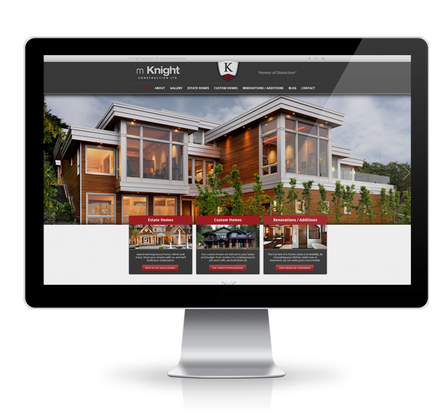
We’re happy to announce the completion of Michael Knight Constructions new re-branding and website. We have been working closely with Michael Knight and his crew to give their company a new refreshed look, and put their website into a whole new league. The website now reflects the amazing quality, craftsmanship, and passion that go into each and every one of Michael Knights projects.
If you haven’t seen their work yet, Mike Knight Construction builds the finest custom homes in Victoria. The challenge was to separate the three levels of services he provides. These including building estate homes, custom homes & finally renovations & additions. The entire new website was developed around these core services.
Check out the new M. Knight Construction website
Here is a deeper look into exactly how we transformed the current brand.
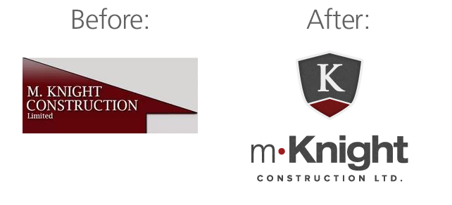
As you can see, we updated the brand by keeping similar colors, but giving it a much more modern look. The key components of the logo are now much more memorable and visually appealing. We now believe the brand truly reflects the dedication to quality and excellence that Mike Knight construction is synonymous with.
First Responsive Design Website
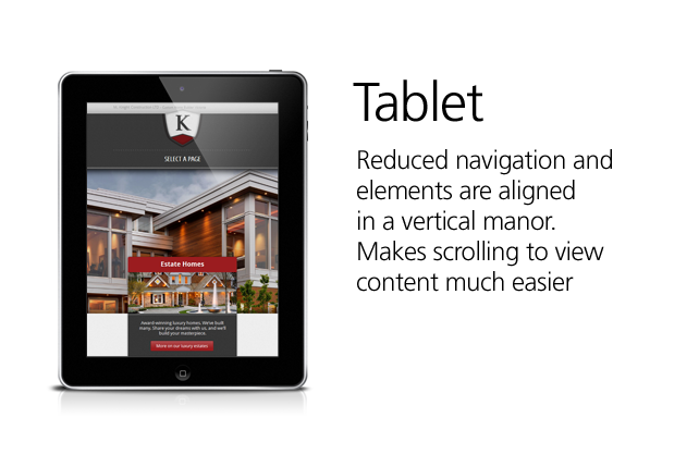
In the past few months, there has been an emerging trend in what is called “responsive design”. With more browsers adapting HTML5 and CSS3 standards, we now have a platform in which to begin developing towards. We are proud to be at the forefront of web design and development, which is why we’ve released our very first website that utilizes these “responsive principles”.
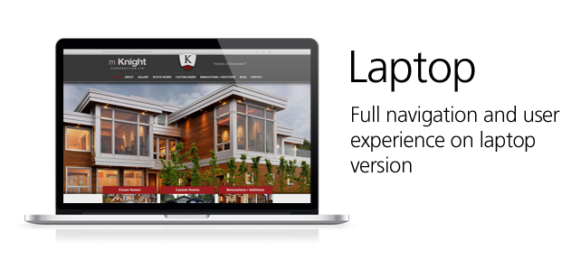
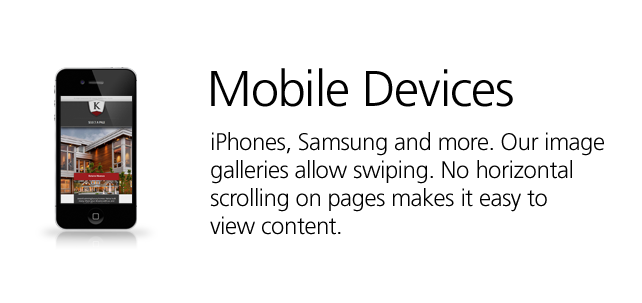
So why the need for responsive web design? Today’s internet user is beginning to access content from a variety of devices, including home PC’s, tablets and mobile devices (iPhone, Android, etc). These are very difference devices with very different screen sizes, and in theory a different experience should be provided for each of these devices. I am sure you have used a device like a tablet or iPhone and found the extreme frustration of having to pinch and zoom just to be able to read the content of the page you are viewing. Responsive design solves this problem by adjusting the site to ensure that text, images and video remain easily readable on EVERY type of screen.
In the past the solution has been to serve the device a “mobile version” if the device was a tablet or phone. This served an issue to some search engines, as they would view it as duplicate content, and thus penalizing you. In addition, if someone wanted to share a link on a mobile device, they could be sharing a mobile link only. If a friend clicked on that link while browsing on their desktop, they would see a stripped down or reduced version. With responsive design, we now have one single page, and it adapts dynamically to the size of the screen.
Business Cards
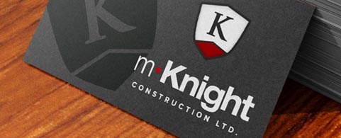
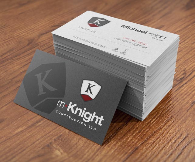
Part of this brand development included new business cards. The business cards we produced for Mike Knight were double sided, with one side including his emblem in a “spot gloss”. Truly a great business card, and one that stands out hands and feet above the competition!
More to come with this brand spotlight
We are completing a touchstone video as well as a large brochure for Mike Knight Construction. These two elements will be the final touch to this flawless brand. Lastly, we will be showcasing pictures of the job site signage that will be erected at some of this future job sites.

