Design Theory: Character Tracking & Typography
One of the easiest and most simple things you can do to improve your logo or design is to simply change the character tracking. Our quick illustrator tip shows you how to use tracking effectively in your designs.
Character tracking, if you don’t already know, is the distance of white space between letters. Almost all popular graphics packages have easy options for you to set character tracking (positive or negative values)
Take a look at the following fictional identity that we have created. It’s coming together, but the fonts use all standard kerning (the distance between 2 letters). The design looks decent, but with a little tweaking we will have this looking even better.
In the above example, we’ve got our “Aquatik” text just the way we would like, but for some reason the “Scuba Diving” sub line isn’t quite right. The solution? You guessed it, character tracking!
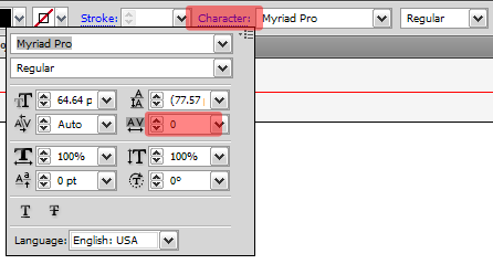
We start by selecting all the “Scuba Diving” text, and then we will go to our type properties, as shown below. Hit the “Character” fly out menu, and then look for the Horizontal Tracking option. You can set positive or negative values in here. Negative values will decrease the space between letters, while positive values will increase the space.
We are using Adobe Illustrator in our example. Look in the type properties in whatever graphics package you are using. This is where character tracking properties will normally be found.
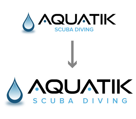
Noting the horizontal tracking as highlighted above, use a positive value (I used 400) until the spacing is as wide as you need. I then brought the font in so it is slightly smaller in width than the text above it. Here is our finished product.
As you can see, we’ve given the text a smaller presence so that your eye has a logical flow to it. You see “Aquatik” first (your brand name), followed by what they do “Scuba Diving”. Here is a before and after of our fictional logo to better illustrate. Make sense?
Character tracking can transfer over into any sort of project you are working on, from print media advertisements, to web, and in this case, a logo. A little extra space between letters can turn a good design into a great one. Here is another example we came up with that uses negative character tracking, to give you a few more ideas of how you can use this tip in your designs!


